UX Case Study | Minze
User Experience and Interface Design for the brazilian brand Minze. I've worked for 3 months on this project, from research to the final prototype.
THE PROBLEM
Minze’s ideal customers are overwhelmed by cluttered online stores and skeptical of brands that claim to be “natural” without offering real transparency.
They seek products that are not only clean in ingredients but also aligned with a visually calming, trustworthy, and intentional digital experience.
Current competitors often fail to meet these emotional and functional needs, either lacking in design, usability, or authenticity.
TIMELINE
July to October of 2024.
TOOLS
Figma
Photoshop
Illustrator
Monday
THE OBJECTIVE
To design a calm, intuitive, and aesthetically aligned e-Commerce experience for Minze, a brand that offers natural, handcrafted soaps rooted in sustainability and minimalist living.
My goal is to create a mobile-first website that reflects Minze’s values: soft, nature-inspired, and slow, while guiding users through a seamless and emotionally resonant shopping journey.
1. USER PERSONA
Camila Rocha is a 31-year-old yoga instructor and content creator living in São Paulo, Brazil. She’s thoughtful about her lifestyle choices, deeply connected to nature, and cares about the ethics behind the brands she supports. She represents Minze’s ideal customer. Someone who isn’t just buying soap, but choosing products that align with a calm, intentional, and eco-conscious life.

2. EMPATHY MAP
Through a series of interviews and behavioral insights, I built an empathy map to better understand Camila’s experience:
-
She says she wants transparency and aesthetics in equal measure.
-
She thinks deeply about every purchase, especially when it touches her skin.
-
She sees a world of “natural” products that still feel over-designed or corporate.
-
She hears her friends talking about zero-waste swaps and boutique soap brands.
-
She feels calm when interacting with clean visuals, but skeptical of greenwashing.
-
She does her shopping on mobile, saves favorites on Instagram, and loves discovering brands through unboxings.
This emotional context helped us connect her lifestyle with her expectations, allowing us to design experiences that feel personal, not generic.

3. PAIN POINTS
Camila’s journey isn’t always smooth. She often hits common pain points:
Many "natural" products still come in plastic or are packed with vague ingredients.
-
Most e-Commerce sites feel too loud or cluttered. She needs peace and clarity.
-
She wants to trust small brands but often lacks visual or social proof.
-
Checkout processes are long, requiring accounts or too many steps.
-
She has sensitive skin and needs to be 100% sure about what’s inside the soap.
These pain points revealed where the gaps in the market are and where Minze can shine.

4. USER STORIES
From Camila’s perspective, we created a series of user stories that translated her motivations into actionable product design:
-
“As a mindful shopper, I want to see clear ingredients, so I feel confident in what I’m using.”
-
“As a returning customer, I want to check out quickly, so I can finish without frustration.”
-
“As a visual person, I want the website to feel beautiful and calming, so it reflects my values.”
Each story pointed to a specific design solution, from adding a scent profile section to offering Apple Pay or bundling gift kits.

5. JOURNEY MAP
We then visualized her path in a User Journey Map, from discovery to loyalty:
-
Discovery: Camila scrolls through Instagram and finds a beautiful Minze ad.
-
Exploration: She clicks through and lands on a serene, minimalist website.
-
Evaluation: On the product page, she finds all the transparency she needs: ingredients, reviews, photos.
-
Decision: She’s convinced and checks out easily via Apple Pay, no friction.
-
Delight: Her package arrives beautifully wrapped in sustainable paper with a thank-you note.
-
Sharing: She snaps a photo for her Stories and tags Minze, becoming a brand advocate.
This journey revealed where we could reduce friction and where we could add moments of delight.

6. STORYBOARD
Finally, we illustrated Camila’s experience in a visual storyboard to connect all these insights with emotional resonance.
Each frame represents a key touchpoint:
-
The calm discovery of the ad,
-
The clarity of the product page,
-
The ease of checkout,
-
And the emotional joy of unboxing.
These scenes visually justify every UX choice, from clean typography to warm, earthy tones and frictionless flow.

7. BRAND GUIDELINES

8. LOW FIDELITY WIREFRAMES

9. HIGH FIDELITY WIREFRAMES

10. LAYOUT GUIDE
Mobile: 4 columns
Desktop: 12 columns

11. SITE MAP MOBILE

12. SITE MAP DESKTOP

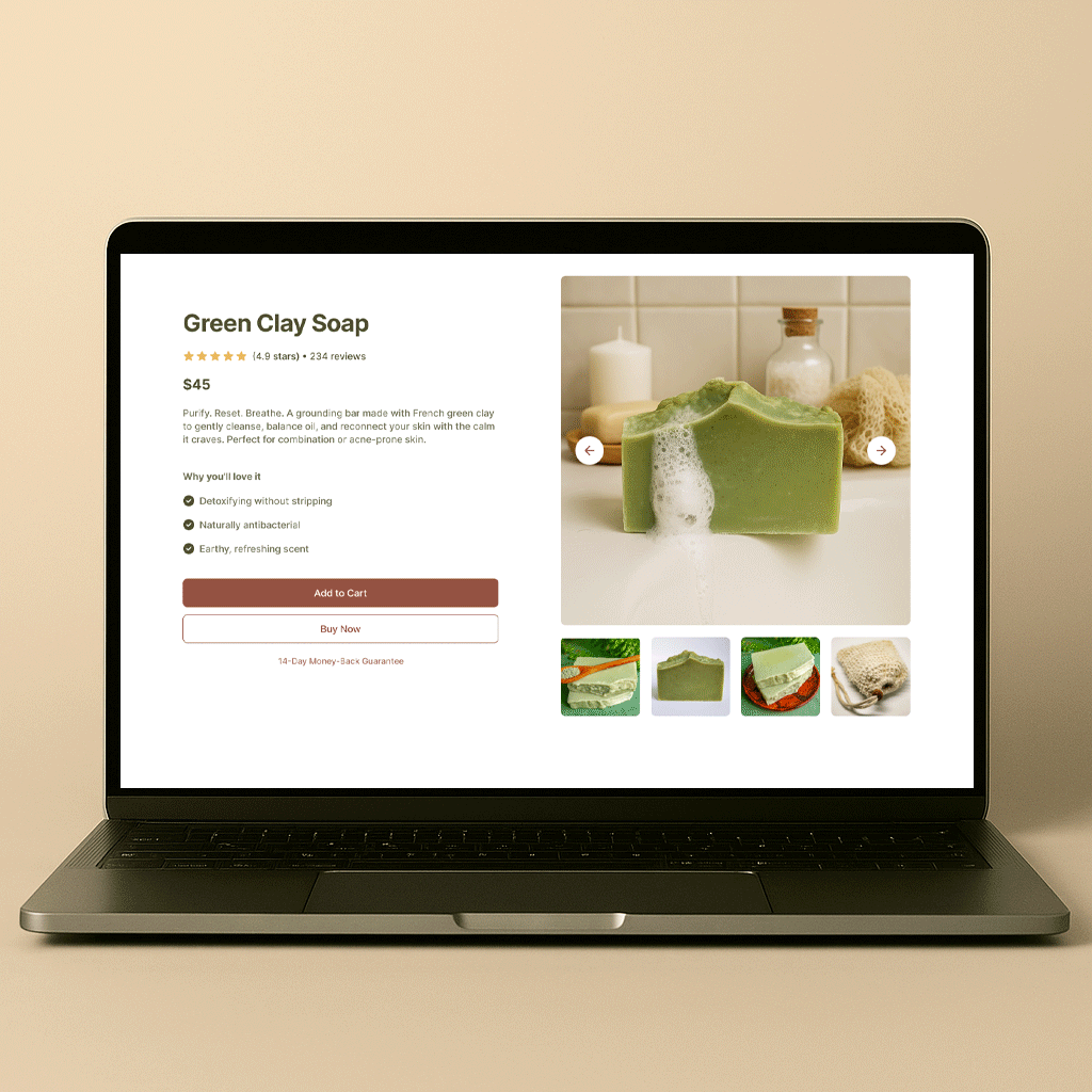
13. PROTOTYPE MOBILE

14. PROTOTYPE DESKTOP